Users contact support after failed logins
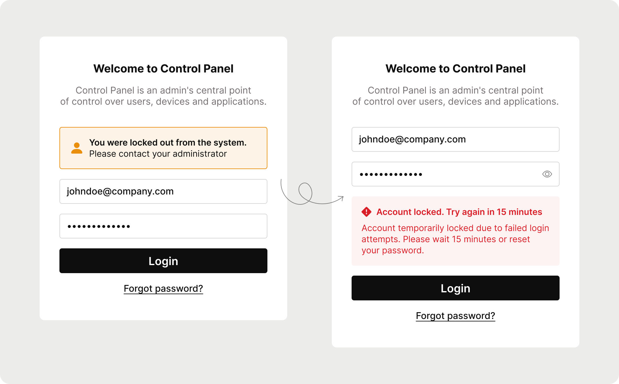
Blocked accounts were among the top-5 reasons for support requests. Users didn’t understand why they couldn’t log in , they weren’t informed that their account was locked after several failed attempts or that it would automatically unlock after 15 minutes. As a result, they repeatedly contacted support instead of simply waiting.
I noticed the pattern and decided to investigate
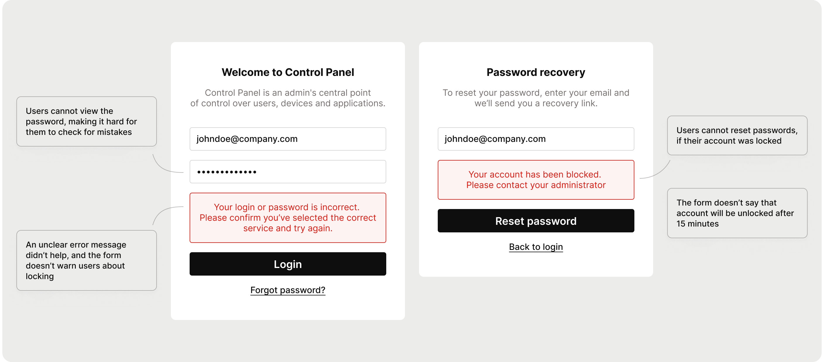
There was no established process for reviewing support cases, so I took the initiative to explore them myself. I found that the login form was misleading – it didn’t clearly communicate what was happening or what users should do next.
Instead of a big redesign, I focused on high-impact fixes
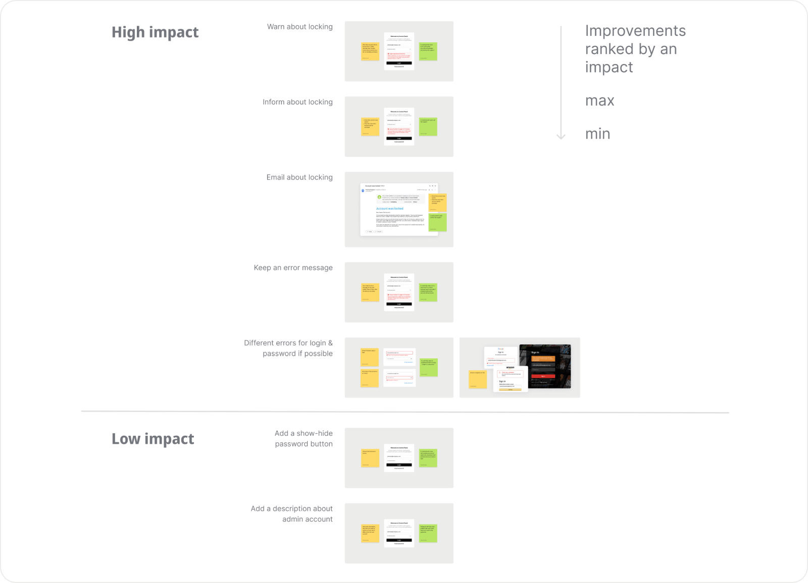
After discussing with developers, I realized that a full redesign would take too much time and resources. So instead, I focused on small, simple improvements with the highest potential impact. I prioritized these ideas, prepared visuals, and presented them to the product manager.
The proposal was approved and added to the development scope.
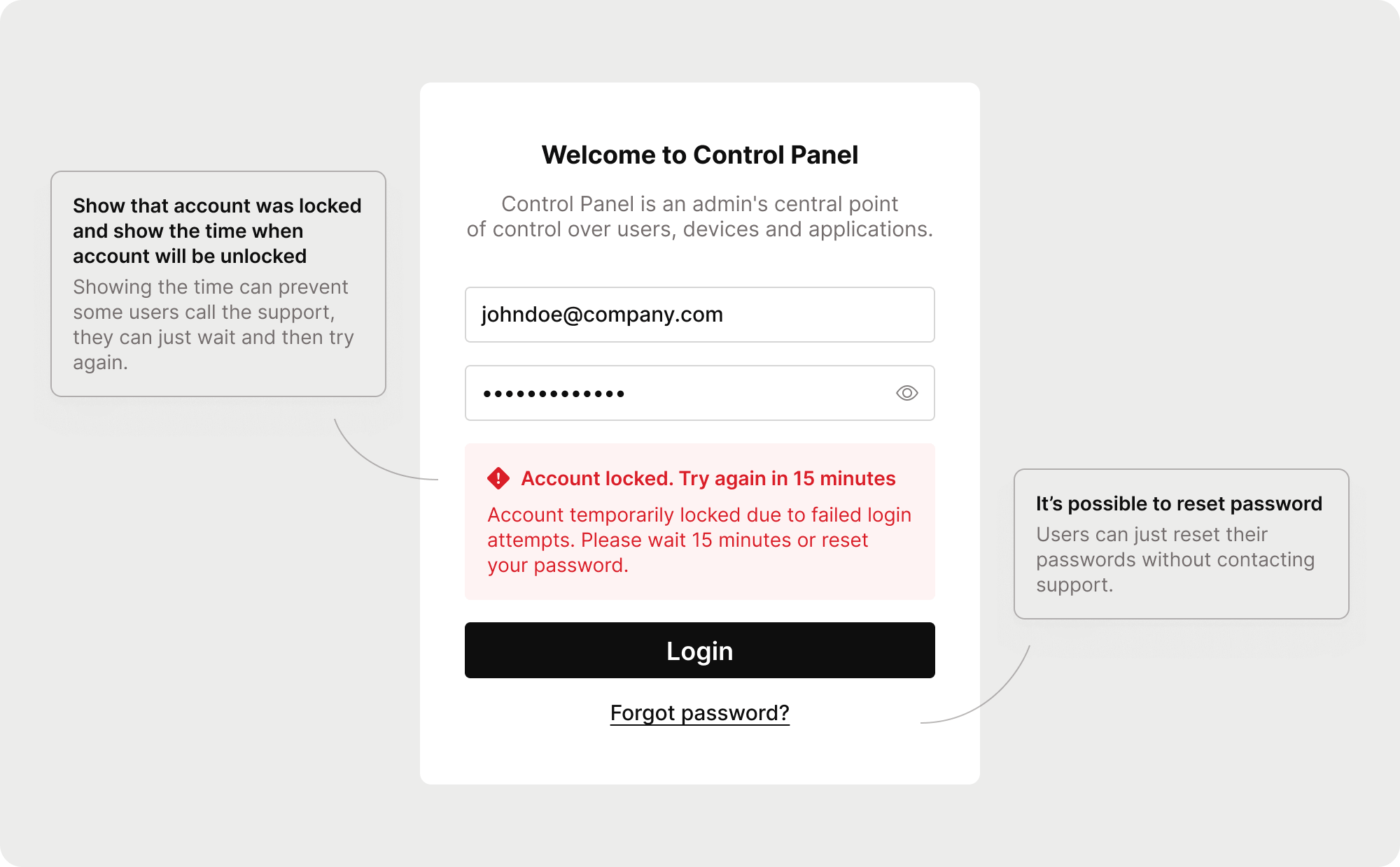
Key improvements
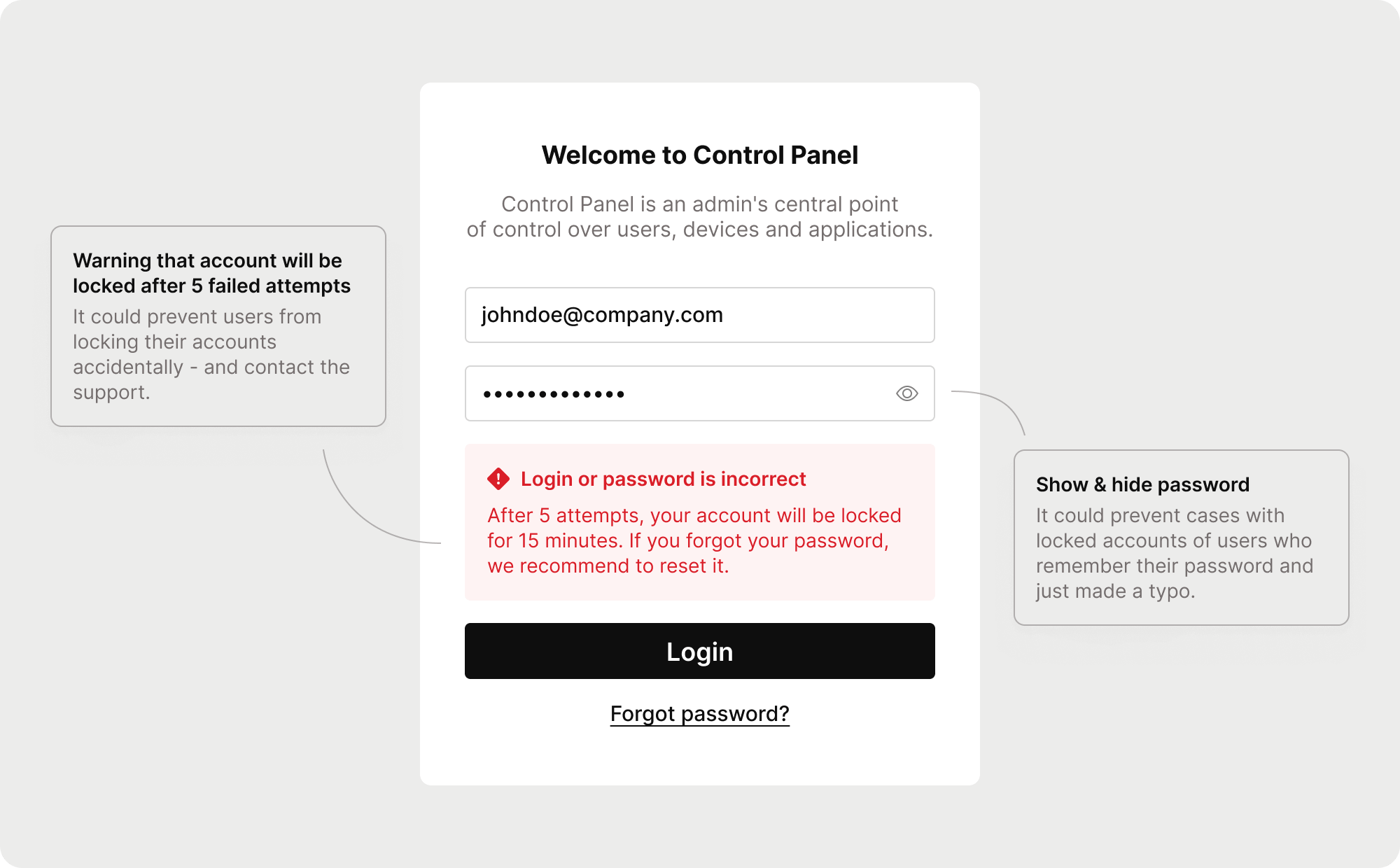
- Added clear messages explaining why the account is locked and for how long
- Allowed password reset even for locked accounts
- Improved error wording and visual consistency
Approved for development and ready to measure results
The project was approved for implementation. Once released, I plan to track its effect by comparing the number of related support cases. I expect these small changes to make the login process clearer and reduce unnecessary support load.
Small initiative, real impact
This case shows how taking initiative and focusing on pragmatic UX improvements can meaningfully improve both user experience and business outcomes even without a full redesign.